
Why Flat Colours Aren't Always Enough
Flat colour fills work for wireframes and functional diagrams. But when you're building marketing materials, presentations, infographics, or branded visuals, flat colours often feel exactly that — flat.
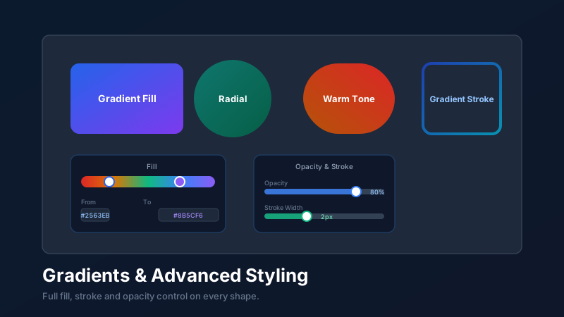
Gradients add dimension. Opacity creates depth and layering. Stroke styling defines edges with precision. Together, these tools are what separate a professional-looking design from an amateur one — and they're all available for free in CollabDraw, directly on every shape, frame, and text object on your canvas.
Gradient Fills: The Basics
A gradient fill transitions smoothly between two or more colours across the surface of a shape. CollabDraw supports linear gradients — where the transition follows a defined direction — across all shape types.
Applying a gradient fill
- Select any shape on your canvas
- Open the Fill section in the properties panel on the right
- Click the gradient option (next to the solid colour toggle)
- Set your start and end colours using the colour picker
- Adjust the gradient angle by dragging the direction handle, or type a specific angle value
The result is immediate — no preview required. You see the gradient update live as you move the colour stops and adjust the angle.
Choosing Gradient Colour Combinations That Work
Not all gradient combinations are equally effective. Here are combinations that consistently produce polished results:
Same-hue gradients
Transitioning between a light and dark shade of the same colour produces clean, professional results. Dark navy to mid-blue, forest green to lime, burgundy to coral. The colour identity stays consistent while the depth changes.
Adjacent-hue gradients
Colours that sit next to each other on the colour wheel blend naturally. Blue to teal, orange to yellow, pink to purple. These feel vibrant without being jarring.
Contrasting neutrals
Deep charcoal to soft grey, cream to white. Neutral gradients make excellent backgrounds — they add subtle depth without competing with the foreground content.
Avoid high-contrast opposite colours
Red to green, orange to blue — complementary colours placed in a gradient often produce a muddy, unsatisfying midpoint. Use these combinations only for very subtle transitions where the midpoint isn't visible.
Opacity: Creating Depth and Layering
Every object in CollabDraw has an opacity control — a percentage value from 0% (fully transparent) to 100% (fully opaque).
Used thoughtfully, opacity is one of the most powerful styling tools available:
Background overlays
Place a semi-transparent coloured rectangle over an image to create a tinted overlay effect. A dark rectangle at 50% opacity over a photo makes text placed on top far more readable — a technique used on virtually every modern website hero section.
Layered depth
Stack shapes at varying opacities to create the impression of depth. A large circle at 10% opacity behind a composition creates a subtle halo effect that adds visual weight without cluttering the design.
Watermark and branding elements
Add a logo or brand watermark at a low opacity (10–20%) across your canvas. Visible enough to identify the source, subtle enough not to distract from the content.
Stroke Styling: Borders With Purpose
Strokes (borders) on shapes are often treated as an afterthought. Used intentionally, they become a key part of your visual language.
Stroke weight
Thin strokes (1–2px) feel refined and minimal. Heavy strokes (4–8px) feel bold and graphic. Match stroke weight to your overall design tone — a corporate infographic uses thin strokes; a bold social media graphic might use heavy outlines as a deliberate aesthetic choice.
Stroke colour
A stroke doesn't have to be dark. Try a light stroke on a dark shape — it creates an inner glow or highlight effect. A stroke in a complementary colour to the fill creates a vibrant, high-contrast outline.
Dashed strokes
Dashed stroke styles are invaluable in diagrams and wireframes — they communicate "this is a boundary", "this is an optional path", or "this is a placeholder" without needing labels. Use dashed borders consistently to create a visual grammar that your audience learns to read quickly.
Combining Techniques: A Professional Workflow
The best designs combine multiple styling techniques in controlled, purposeful ways. Here's a typical workflow for a polished card component:
- Create a rounded rectangle and apply a subtle dark-to-darker gradient fill for depth
- Add a very thin light stroke (1px, 30% opacity white) to create the impression of a highlight edge
- Place an image inside the card and set its opacity to 85% to soften it slightly against the background
- Add a text label with 100% opacity so it reads cleanly against the softer background
- Group all elements and duplicate the card — each instance is independently editable but visually consistent
None of these steps require design experience. They require only an understanding of what each control does — and now you have that.