
Why Dashboard Design Matters Before Development
Building a dashboard without a design first is one of the most expensive mistakes in product development. Engineering teams build the wrong layout, stakeholders request wholesale changes after seeing the first build, and months of work get thrown out.
A high-fidelity dashboard template solves this. Before a single line of code is written, stakeholders can interact with a realistic, data-populated mockup — approve the layout, request changes, and sign off. The engineering team then builds exactly what's needed.
CollabDraw's free dashboard templates give you a head start on this process with professionally designed starting points for every common dashboard type.
Dashboard Template Categories
The template library includes dashboards for:
- Analytics and marketing — traffic metrics, conversion funnels, campaign performance, channel breakdowns
- Sales and revenue — pipeline stages, monthly recurring revenue, quota attainment, deal velocity
- Operations and logistics — delivery tracking, inventory levels, SLA compliance, team utilisation
- Product and engineering — sprint velocity, bug count, deployment frequency, uptime
- Finance — P&L summaries, budget vs. actual, cash flow, expense breakdowns
- Executive / C-suite — high-level KPI summaries with the most important numbers at a glance
Anatomy of a Dashboard Template
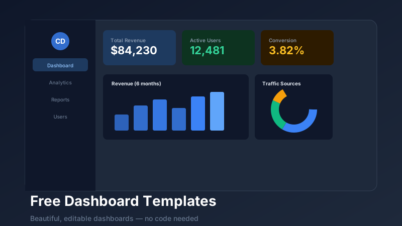
Each CollabDraw dashboard template includes editable versions of every standard dashboard component:
KPI Cards
Rectangular or rounded cards showing a single metric: a large number, a trend arrow, a percentage change, and an optional sparkline. The most important numbers live here — revenue, users, conversion rate, churn.
Charts
Line charts for time series, bar charts for comparisons, donut charts for distributions, area charts for cumulative trends. Each chart in a CollabDraw template is a live, editable chart object — change the data and the visual updates automatically.
Data Tables
For ranking and detail views — top customers, recent transactions, open issues, team leaderboards. CollabDraw's table element supports sorting indicators and custom cell colours for at-a-glance status encoding.
Status Indicators
Coloured badges (green/yellow/red), progress bars, and gauge charts for showing health, utilisation, and completion percentages.
How to Customise a Dashboard Template
- Open CollabDraw and navigate to Templates → Dashboards
- Click "Use Template" on any dashboard design
- The template loads as a fully editable canvas layer
- Click any element to select and edit: change text, update chart data, swap colours, resize sections
- Use the properties panel on the right to adjust fonts, border radius, fill colours, and shadows
- Add or remove sections by duplicating or deleting canvas objects
Presenting Dashboard Designs to Stakeholders
Once your dashboard mockup is ready, share it as a live link for stakeholder review. Stakeholders can leave comments directly on specific elements — "this chart is confusing", "this KPI card should show MoM not YoY" — without any account or software needed on their end.
This review-and-iterate cycle typically takes hours, not weeks. Compare that to the alternative: building the dashboard in production, demoing it, then refactoring based on feedback.
Export for Handoff
When the dashboard design is approved, export options include:
- PNG — high-resolution screenshot for presentations and documentation
- PDF — for specification documents and stakeholder reports
- Share link — always-current live version for engineering handoff
Engineers can annotate the live share link with technical questions and get answers from the designer in context — no email chains, no miscommunication about which element they're discussing.