
Why Data Visualisation Matters More Than the Numbers
The same data set, presented as a table versus a well-designed chart, tells a completely different story. The chart is understood in under three seconds. The table requires minutes of reading and mental arithmetic. For anyone communicating to a non-technical audience — investors, clients, board members, or the general public — visualisation isn't optional.
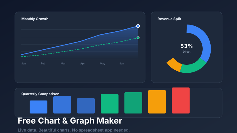
CollabDraw includes a built-in chart editor that lets you create, customise, and embed data visualisations directly on your canvas — no separate graphing tool, no copy-pasting between apps, no formatting headaches.
Chart Types Available
- Bar chart — horizontal or vertical. Best for comparing discrete categories across a single measure.
- Grouped bar chart — compare multiple measures across categories side by side.
- Stacked bar chart — show part-to-whole relationships within each category bar.
- Line chart — best for time series and trends. Smooth or angular line options.
- Area chart — line chart with a filled area beneath. Emphasises cumulative volume over time.
- Pie chart — part-to-whole relationship for a small number of categories (ideally under 6).
- Donut chart — pie chart with a hollow centre, often used for a key metric label in the middle.
- Scatter plot — relationship and correlation between two numeric variables.
- Progress / gauge — single-metric progress towards a goal. Great for KPI dashboards.
Creating a Chart in CollabDraw
- Open the Charts panel from the left toolbar
- Select your chart type and click to place it on the canvas
- Open the data editor — a simple spreadsheet-style table where you enter labels and values
- The chart updates live as you type
- Use the properties panel to customise colours, fonts, axis labels, grid lines, and legend position
- Resize the chart by dragging its corners — it stays sharp at any size because it renders as a vector
Choosing the Right Chart Type
Use a bar chart when...
You're comparing values across different categories with no inherent order, or when you have more than 4 categories (pie charts become unreadable beyond 5–6 slices).
Use a line chart when...
Your data has a temporal dimension — sales over months, user growth over time, temperature over days. The line emphasises continuity and trend direction.
Use a pie or donut chart when...
You're showing how a whole is divided into parts and you have fewer than 6 categories. If the segments are nearly equal in size, a bar chart is almost always clearer.
Use a scatter plot when...
You want to show correlation or clustering between two variables — ad spend vs. revenue, study hours vs. test scores, price vs. demand.
Chart Design Best Practices
Start at zero
Bar charts with a y-axis that doesn't start at zero are misleading. Differences look dramatically larger than they are. Always start bar chart axes at zero unless you have a specific, clearly labelled reason not to.
Label directly
Direct data labels on chart elements are more readable than legends, especially in static exports. Legends require the reader to look back and forth; direct labels keep the eye on the data.
Limit colour
Use colour purposefully — highlight one key data series, not every series. When everything is highlighted, nothing is. Use a neutral grey for context data and a bold accent colour for the series that matters most.
Remove chart junk
Grid lines, borders, tick marks, and background fills are visual noise unless they serve a purpose. Start minimal and add elements only when they improve comprehension.
Embedding Charts in Other Designs
Because CollabDraw charts are canvas objects, they can be placed inside any other design element — inside a dashboard template, within an infographic frame, inside a presentation slide. You can layer text annotations, arrows, and callout boxes directly on top of charts to highlight specific data points.
When you export the canvas as a PNG or PDF, charts are included at full resolution. Share the live link and viewers see the full interactive context of the chart within its surrounding design.